Style is King Footnotes #1: Blackpowdergames' "Betrayer"
Researching for my piece on visual innovators in games, I sent a few questions to Blackpowdergames, makers of lovely looking Betrayer. Here's what David Longo, art director, had to say in reply.
In your own words: What makes your games' visual style unique?
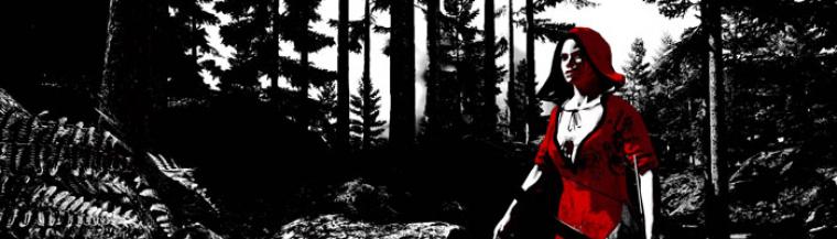
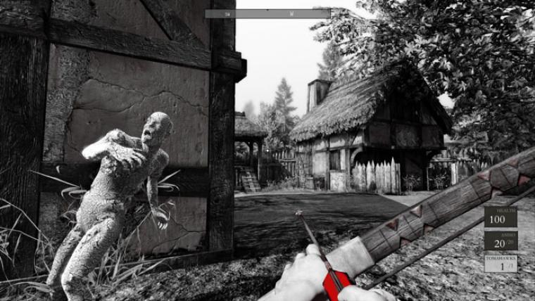
The high contrast black, white and red look of Betrayer is uncommon but there have been other games, movies and comics that have taken a similar approach, so that's not revolutionary. I think what's unique about the Betrayer's style and the use of a minimalist palette with high-fidelity content. Most games that have taken a black and white (and maybe color) approach have tended to go more comic or highly stylized in the forms whereas I think our game has the grounding of realistic forms and surface treatments. To me Betrayer feels like a beautiful dark fairytale illustration from the early 20th century where the stylization doesn't depart from reality in a dramatic way (other than the color palette) and there's a richness to the details, especially when the wind blows.We've also added controls to let players adjust the visual style to suit their personal tastes in a way I don't think has been done before. We decided to include sliders to adjust the black and white contrast for people who wanted a softer black and white look and added a color slider for the gamers who prefer more conventional looking game. When we were at PAX Prime showing off the sliders for the first time, people had fun adjusting the look but most of the people went back to the black white and red look which was encouraging.
Why did you choose that style?
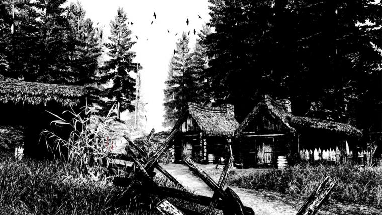
We tried a variety of styles throughout development: both color treatments and variations on the black, white and red theme but kept coming back to the high contrast look because of the tension it added. The game became more suspenseful with the shapes of things in the world appearing and disappearing as you explored. In a world full of mysteries and supernatural threats roaming the landscape, we felt this look best supported the experience.
What do you think about the industry's constant striving for photorealism?
I think it's great. As our computing power increases developers are going to find ways to push the technology to make the visual fidelity more convincing and the experiences more immersive. It's thrilling to play a game like The Last of Us and feel like you're in a real place, experiencing a zombie apocalypse in those beautiful deserted and overgrown environments. It's also cool to see games like Bioshock Infinite stylize the look of their game in ways that utilize photorealistic advancements in the technology but not in an entirely realistic way. I'm not talking about the obvious design of the floating cities thing... I love their hyper-saturation of the bounced light in that game. It's not realistic but what they did with it could not have been done without the progress made in games to replicate the way light behaves in reality.
At the same time, I love the stylistic variety happening in the indie scene. Minecraft isn't photorealistic but I think that game is visually compelling. There's a beauty in its simplicity and abstraction. And of course there are games like Journey which is absolutely beautiful and highly stylized. Like Bioshock Infinite though, there's a lot of sophisticated technology going on there (the atmosphere and depth created with the haze, wind and sand) that comes from trying to capture an element of realism.
Do you see other visual arts and artists as inspiration? If so, which in particular?
Absolutely: other games, movies, comics, painters, photographers, graphic design and everyday moments provide a limitless supply of inspiration for me and I think most of the guys on the team. Early in development I was looking at the illustrations of NC Wyeth where the themes for a lot of his paintings were swashbuckling adventures and some of his paintings had these beautiful forests and giant fairytale trees. Arthur Rackham is another illustrator I referenced who has a beautiful and haunting style in his illustrations and has some of the most beautiful drawings of trees and brambly underbrush. When there are specific inspirations like that, especially early on in the project, everyone on the team is encouraged to share with the team and post images on our project's wiki as our game's unique look takes shape.
Someone comment that our game looked like an Ingmar Bergman film, an incredible visual storyteller to have our game compared to.We'll also reference moments in other games or scenes from movies that capture a look or tone that we think would be cool to try glean something from to fit our game. Some of the movies that most of us watched while making Betrayerwere: Sleepy Hollow, Dragonslayer, 13th Warrior, Last of the Mohicans, Brotherhood of the Wolf, Pan's Labyrinth, New World, Valhalla Rising, The Village, Aguirre: The Wrath of God and more. Each of those has moments or details that fed into the look and feel we tried to get into Betrayer.On a somewhat related note, someone in the game screenshot community (Midhras) compared our game to Gustave Doré's etchings for Dante's The Divine Comedy, which I thought was awesome. I don't think anyone on the team ever referenced his work or made the comparison but I've studied his work for years and have books on his etchings around my house. Doré is a master of composition and lights and darks and it was cool that someone thought he'd been an inspiration for the game. We also had someone comment that our game looked like an Ingmar Bergman film at an indie games event in San Francisco earlier this month, another incredible visual storyteller to have our game compared to.
Do you think that it's more difficult to succeed for games that try something different visually?
I think it can be but at the same time, I think if a game is fun, people who do like the look will tell their friends and get some folks outside of their aesthetic comfort zones.
Sonntag, Dezember 8, 2013 - 09:43