Style is King Footnotes #2: Santa Ragione's "Mirror Moon"

Researching for my piece on visual innovators in games, I sent a few questions to Santa Ragione, the Italian developers of the fantastically abstract and beautiful Mirror Moon EP. Unfortunately, their thoughtful and interesting reply arrived too late for inclusion in my article, so here is what Pietro Righi Riva, one half of the creative duo of Santa Ragione, had to tell me.
In your own words: What makes your games' visual style unique?
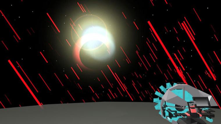
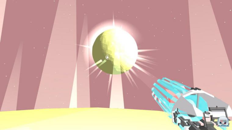
MirrorMoon EP has a distinctive look, it's true. We don't know if it is unique, but we tried our best to make it stand out. Probably the most distinctive aspect of the visual style are all the various color's fields that each new planet creates. As you might know, the camera vertical axis is fixed in the game. That allowed us to have a sort of "prepared canvas", always divided in 1/4 ground and 3/4 sky, on top of which new elements were appearing and disappearing with a lot of contrast and tension. MirrorMoon EP turned out to be a sort of hard-edge digital painting.

Why did you choose that style?
We wanted MirrorMoon EP visual style to be so good that any screenshot would look memorable. it’s a kind of style that we’ve been researching with our work across our previous games, such as FOTONICA and Street Song. it is important to have a distinct style and to research an expressive form that is personal and meaningful. Of course, it’s also a matter of making a game look as good as possible with the time and resources we had. Time and resources, along with core game design elements, were the fundamental boundaries in which the visuals were developed. We did not develop the visual style on its own but we tailored it around the game needs, around our abilities and our limitations.
As an example, architectures are transparent because we did not want the player to deal with collisions against objects on the planet surface. It would have made walking more difficult and frustrating. It would have obscured important gameplay elements in the sky. It would have made it harder to justify why physical structures (instead of transparent and ethereal ones) were disappearing during daytime or nighttime like ghosts. There are many others aspects of the visual style that shaped the visuals through the development.

What do you think about the industry's constant striving for photorealism?
I believe that one of the main reasons for photorealism is the ability to be easily understood and appreciated. The lower the level of abstraction the easier is the interpretation requested to understand the fictional setting. By reducing the ambiguity we are trying to solve a communication problem.
Realism creates higher expectations, and most of the time games are incapable of delivering on those expectations.
At the same time, though, the lower the level of abstraction the lower is the players’ ability to actively analyze or speculate over the world they are in. This "need for interpretation" can be used as part of the design process. It does requires more effort to understand in respect to realism that try to reduce ambiguity through the use of real-looking elements.
We are fascinated by both approaches, although we are not that interested in working towards the photorealism, yet. We believe that realism adds another peculiar design problem: it creates higher expectations, and most of the time games are incapable of delivering on those expectations. Simply recognizing the re-use of the same asset in a very detailed game (like seeing many times the same model of a person reused in different locations, in an open world game like GTA) will disrupt immersion and make the game world less believable.

Do you see other visual arts and artists as inspiration? If so, which in particular?
There is a enormous amount of reference that goes deep into our past and present. From painting to architecture, illustration, sculpture, digital art, older games, and contemporary art.
If I had to name a few I'd say that during MirrorMoon EP development we were inspired by the work of Moebius (French illustrator and comic artist), Lebbeus Woods (American architect) and by the Italian indie game Noctis IV.

Do you think that it's more difficult to succeed for games that try something different visually?
Not necessarily, but if by "different visually" we mean “abstract”, like in MirrorMoon EP, then I'd say yes. Mainly because abstraction requires a higher level of effort to be deciphered and sometime it will force players to attribute subjective meanings over visually obscure elements of the game.
If by "different visually" we mean all kind of styles that don't directly go towards the reproduction of the real world, then the answer is more complex. It can be a canonic cartoon style that is easier to appreciate or more sophisticated illustration techniques that will reach the same level of difficulty that geometrical abstraction has.
