Style is King Footnotes #6: Monochroma

In continuation of my piece on visual innovators in games, I was drawn to the black and white beauty of Monochroma. I asked one of its creators, Burak Tezateser of Turkish developer Nowhere Studios, a few questions about the game.
A short description of Monochroma could be "Limbo meets Ico", but Monochroma's style emphasizes different aspects and uses 3D in a 2D-setting. In your own words: What makes your games' visual style unique?
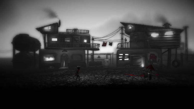
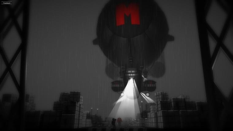
We created a dystopian world and a visual style reflecting that oppression and hypocrisy. We wanted the game to look dark and restless. Yet we used red expressively to create a striking contrast, something that doesn't really fit to the environment to tell the player subtly something is wrong. The player suddenly thinks, then maybe the whole black and white thing is wrong.
Monochroma appears to quote 1950s architecture, culture and environments. Why did you choose that style, that timeframe?
50's is the era where the consumer society came into power and we are criticizing the consumer society, that's why we have chosen that era. Dystopias have a very important role. They spot the issues in our current world and they take them to the extreme. They warn us that if we can’t find a solution for these issues we will end up in a similar situation. We made something unusual and created a dystopia in the past, because maybe we're living in something similar to that dystopia in our current world.
Do you see other visual arts and artists as inspiration? If so, which in particular?
Visually we have been inspired by movies a lot. To name a few, Alex Proyas works "The Crow" and "Dark City" inspired us while creating the city. Metropolis, City of Lost Children and Blade Runner were also imporant inspirations for the atmosphere. Aesthetics of Limbo was important as well while creating the visual language and the consistency throughout the game.

Although there are a few Turkish studios doing international games - TaleWorlds comes to mind - you are geographically still very much on the margins of the games industry. Do you think that this "outsider perspective" can also be seen as an advantage? Or does it even matter anymore, with the internet and Kickstarter basically making the business truly global?
Taleworlds is an amazing studio with amazing developers. I believe they created the ecosystem in Turkey and made something truly unbelievable with very scarce resources. I also appreciate that they are telling their own stories and I believe this is something we have to do as well. Only then, we can create a new perspective. Telling your own story with images and words understandable by the whole world is the key of creating a masterpiece.

How would you describe the Turkish dev scene?
Evolving. We recently started to be able to keep talented developers in our studios. In the past all of them were leaving to more industrialized countries. Now we have mobile, social game and PC and console deveopers, a nice community that is very supportive to each other and some government funds to keep the companies alive. We are lacking education programmes, investors and specialists. Currently we have too much generalists as the studios are often run by few people.
Do you think that it's more difficult to succeed for games that try something different visually?
I'm thinking exactly the opposite. If you can't beat the current styles by making something with a better production, you should try something new. And that's the only exit way for indie developers. Visuals is an important part to make your game differentiate as well as gameplay and narration.
Monochroma will be released soon; meanwhile, you can take a look at the alpha demo.
Dienstag, März 11, 2014 - 16:04
